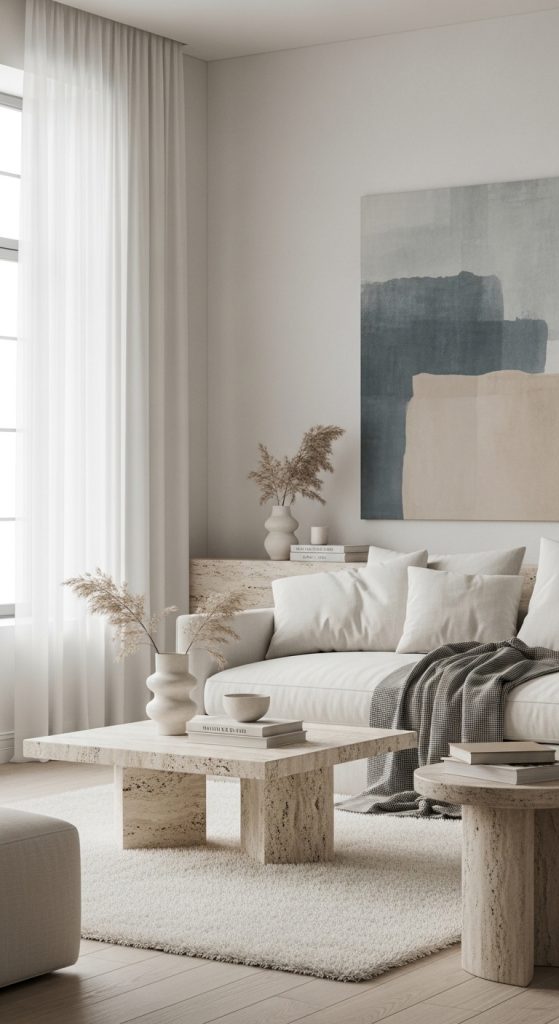

Soft summer color palettes are beloved for their calm, airy, and effortlessly elegant feel. Unlike bold or high-contrast palettes, soft summer colors focus on muted tones, gentle pastels, and low-saturation hues that feel soothing and refined. These palettes are inspired by hazy summer skies, coastal breezes, blooming florals, and sun-faded landscapes. They’re perfect for interiors, fashion, branding, events, and creative projects that aim to feel light, welcoming, and timeless.
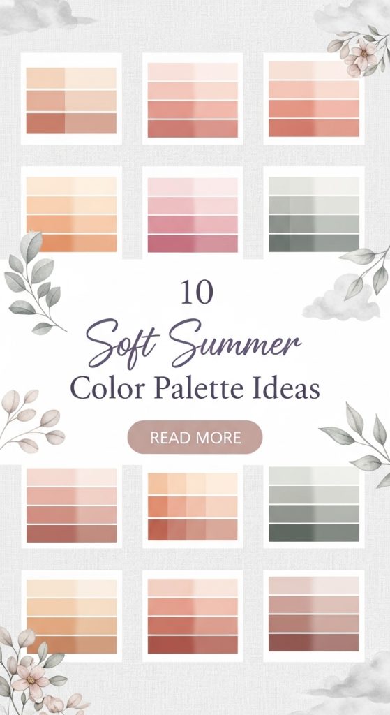
One of the key strengths of soft summer palettes is versatility. Because the colors are gentle and balanced, they work beautifully together without overwhelming the eye. Soft summer tones often include dusty blues, muted greens, warm off-whites, pale peaches, soft lavenders, and gentle grays. These shades blend seamlessly, creating a cohesive look that feels intentional rather than busy.
Another reason soft summer color palettes are so popular on Pinterest is their emotional impact. These colors evoke calm, comfort, and warmth. They’re ideal for creating spaces or designs that feel relaxing and approachable. Whether used in home décor, graphic design, weddings, or seasonal styling, soft summer palettes bring a sense of quiet beauty that doesn’t rely on trends.
Soft summer palettes also age well. Because they’re not overly bright or trendy, they remain appealing year after year. This makes them especially useful for long-term projects like home interiors, brand identities, or capsule wardrobes. They also photograph beautifully, which is why they perform so well on visual platforms like Pinterest.
From a practical standpoint, soft summer colors are easy to work with. They pair well with natural materials like wood, linen, cotton, stone, and ceramic. They also complement a wide range of neutrals, making it simple to expand or adjust the palette as needed. This flexibility allows you to start with a small set of colors and build outward without losing cohesion.
In this article, you’ll discover 10 carefully curated soft summer color palette ideas. Each palette is explained in detail, including its overall mood, where it works best, how to use it effectively, and the types of materials or elements that pair well with it. These palettes are designed to inspire everything from interior styling to creative projects, offering gentle color combinations that feel fresh, balanced, and endlessly usable.
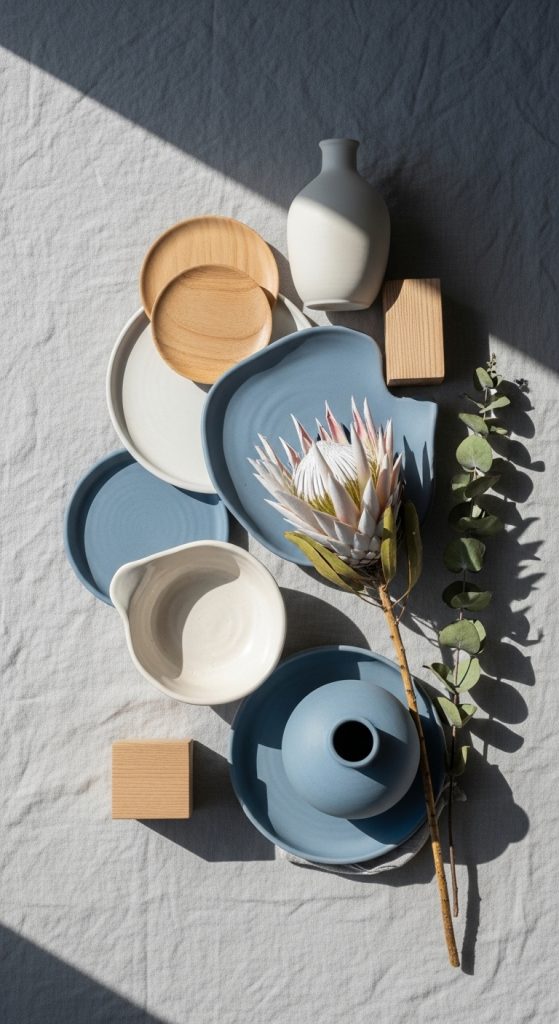
1. Soft Blue, Warm White, and Pale Gray
This palette is inspired by summer skies and light coastal breezes. Soft blue brings calmness, warm white adds brightness, and pale gray provides balance without heaviness.
It’s ideal for interiors, branding, and minimalist designs that need subtle depth.
How to Use This Palette
- Use soft blue as the main accent color.
- Apply warm white as the primary base.
- Add pale gray for contrast and structure.
- Keep finishes matte or lightly textured.
- Balance with natural light.
Works Well With
- Linen and cotton
- Light wood
- Ceramic and stone
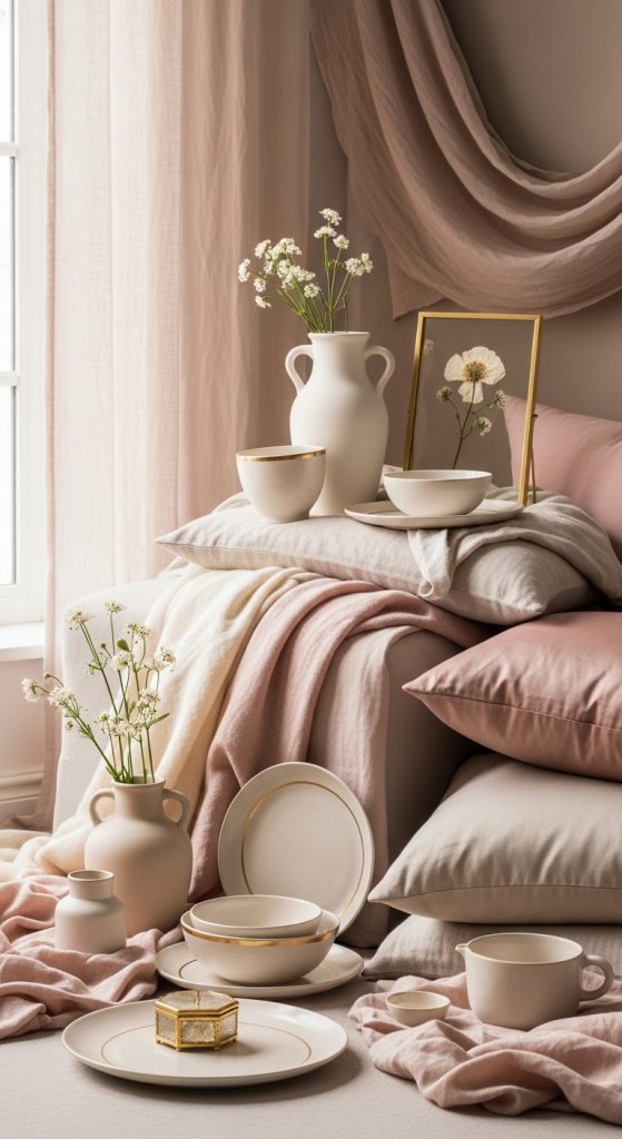
2. Blush Pink, Soft Beige, and Cream
This palette feels romantic, gentle, and warm without being overly sweet. Blush pink adds softness, beige grounds the palette, and cream keeps it light.
Perfect for bedrooms, weddings, and feminine branding.
How to Use This Palette
- Use blush pink sparingly for accents.
- Anchor the space with beige tones.
- Layer cream for brightness.
- Avoid high-contrast elements.
- Keep textures soft.
Works Well With
- Fabric textures
- Light wood
- Gold or brass accents
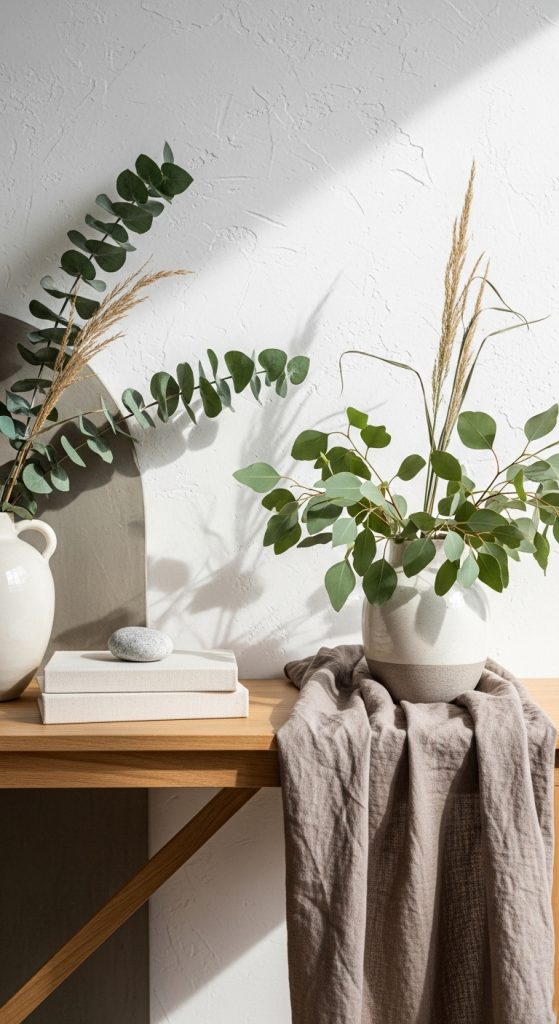
3. Sage Green, Off-White, and Soft Taupe
Inspired by nature, this palette feels fresh yet grounded. Sage green is calming, off-white keeps it airy, and taupe adds warmth.
Ideal for living spaces and lifestyle brands.
How to Use This Palette
- Use sage green as the feature color.
- Apply off-white generously.
- Add taupe for depth.
- Mix matte and natural finishes.
- Balance with greenery.
Works Well With
- Wood furniture
- Stone accents
- Natural fibers
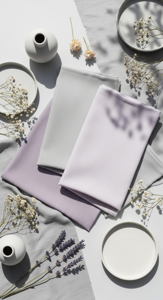
4. Dusty Lavender, Pale Gray, and Soft White
This palette is gentle, elegant, and slightly whimsical. Dusty lavender adds color without intensity, while gray and white keep it balanced.
Perfect for creative studios and soft romantic designs.
How to Use This Palette
- Use lavender as an accent.
- Keep gray neutral and subtle.
- Use white to open the space.
- Avoid bold contrasts.
- Layer similar tones.
Works Well With
- Soft textiles
- Matte finishes
- Subtle metallics
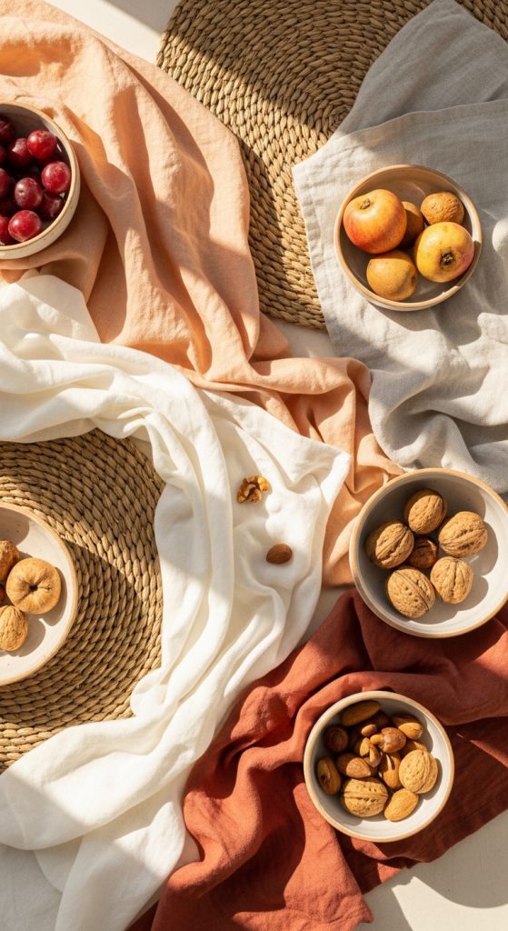
5. Pale Peach, Warm Ivory, and Light Sand
This soft summer palette feels sunny and welcoming. Pale peach adds warmth, ivory keeps it bright, and sand tones ground the look.
Great for summer styling and event décor.
How to Use This Palette
- Highlight peach in small areas.
- Use ivory as the main base.
- Layer sand tones throughout.
- Keep the palette light.
- Use natural textures.
Works Well With
- Linen fabrics
- Wicker and rattan
- Light ceramics
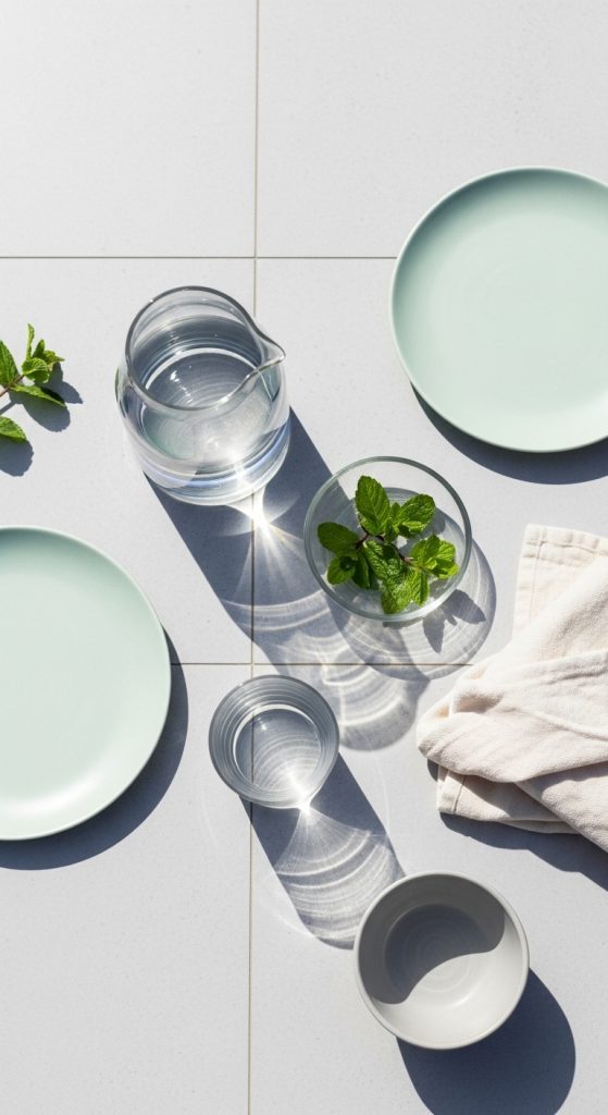
6. Soft Mint, Cream, and Light Gray
Fresh and airy, this palette is inspired by summer mornings. Soft mint feels clean, cream adds warmth, and light gray balances everything.
Ideal for kitchens, bathrooms, and fresh brand designs.
How to Use This Palette
- Use mint as a gentle accent.
- Apply cream to soften the space.
- Add gray for structure.
- Keep lines clean.
- Avoid dark contrasts.
Works Well With
- Tile and glass
- White wood
- Minimal décor
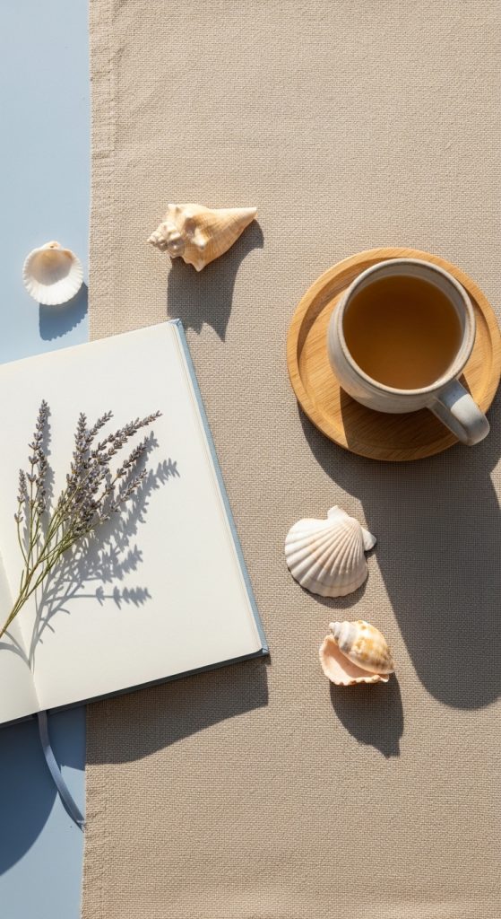
7. Powder Blue, Soft Sand, and Warm White
This palette has a coastal, relaxed feel without being themed. Powder blue is soothing, sand tones are grounding, and warm white brightens.
Perfect for calm interiors and lifestyle visuals.
How to Use This Palette
- Feature powder blue in textiles.
- Use sand as a grounding color.
- Keep white consistent.
- Layer similar shades.
- Use soft lighting.
Works Well With
- Natural wood
- Linen fabrics
- Woven textures
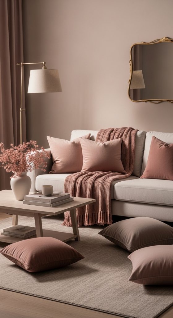
8. Muted Rose, Light Taupe, and Off-White
Elegant and refined, this palette balances warmth and softness. Muted rose adds subtle color, taupe grounds it, and off-white keeps it airy.
Ideal for fashion, branding, and cozy interiors.
How to Use This Palette
- Use rose in accents.
- Apply taupe for structure.
- Use off-white generously.
- Avoid sharp contrasts.
- Layer gently.
Works Well With
- Upholstered furniture
- Soft textiles
- Warm metals
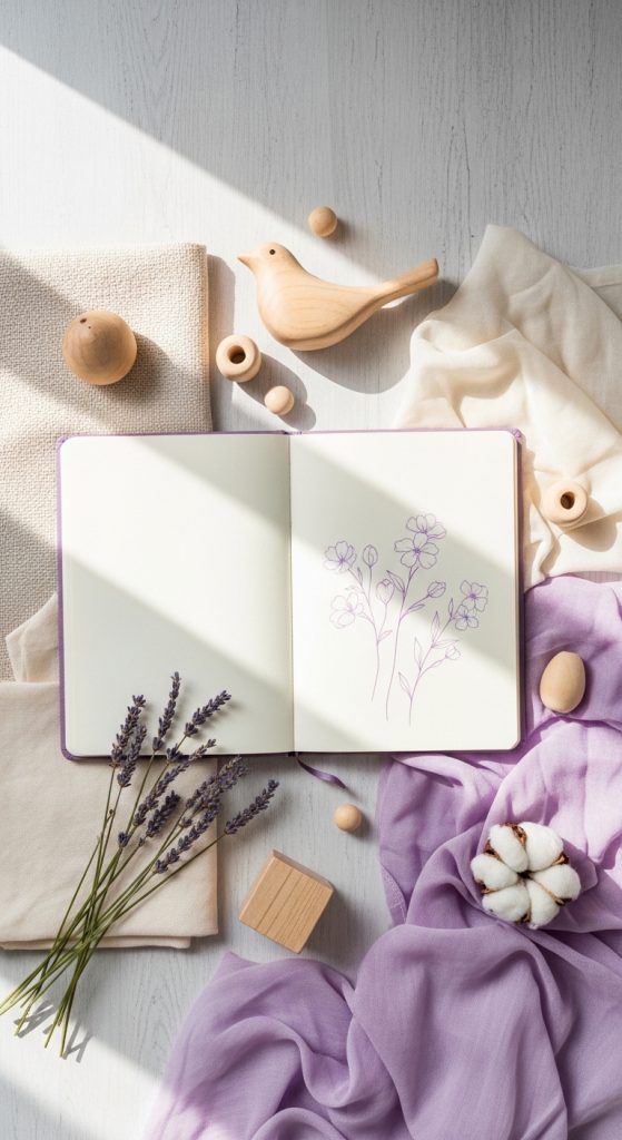
9. Soft Lilac, Cream, and Pale Wood Tones
This palette feels creative yet calm. Soft lilac adds personality, cream keeps it neutral, and pale wood adds warmth.
Great for creative spaces and gentle summer themes.
How to Use This Palette
- Use lilac in moderation.
- Balance with cream surfaces.
- Add pale wood textures.
- Keep décor simple.
- Use natural light.
Works Well With
- Wood furniture
- Soft fabrics
- Minimal accessories
10. Hazy Blue-Gray, Warm White, and Soft Beige
This palette is subtle, modern, and timeless. Blue-gray adds depth, warm white keeps it light, and beige softens the overall look.
Perfect for modern interiors and clean designs.
How to Use This Palette
- Use blue-gray as a base.
- Add warm white for brightness.
- Layer beige accents.
- Keep finishes soft.
- Avoid bold colors.
Works Well With
- Stone and concrete
- Soft textiles
- Neutral décor